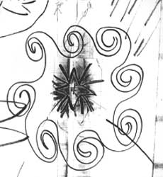
| The initial
sketch submitted by the Small Church Celebration committee from
which the logo was to be based on. |
 |
|
 |
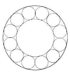
| The committee's
design was simplified to a geometric "grid" with the
intent of translating the feel and purpose of the original design
into a bolder, more effective graphic. |
|
|
 |
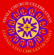
| The outer
circles were formed into spirals and the four W's (a major component
for the client) were added. The W's were positioned so the negative
space between them formed spires and rooftops of churches. |
|
|
 |
| The W's
have been altered slightly to better integrate them. The shading
has been altered to add more contrast and punch. The outer circle
has been removed to free up the design and a cross has been
added to the center of the logo. |
|
|
 |
The
final design
back
to previous page .
|
|
|
 |